#Adding Hyperlink to Images
Explore tagged Tumblr posts
Visit Tumblr Blog
Explore Tumblr blogs with no restrictions, modern design and the best experience.
Last Seen Tumblr Blogs


Fun Fact
In 2020, 27% of US Tumblr users had an annual household income of over $100,000.
Text
[Photo of Tal Mitnick]
Tal Mitnick, the 18-year-old Israeli teenager who refused to serve in the Israel Defense Forces for opposing the occupation of Palestine and killing of civilians in Gaza, speaks to press in Tel Aviv, Israel, on Oct. 25, 2023. Photo: Mostafa Alkharouf/Anadolu via Getty Images
IN ISRAEL, NEARLY everyone is conscripted into the military when they turn 18, but Tal Mitnick refused. He became the first Israeli 18-year-old to conscientiously object to joining the Israel Defense Forces as nationalist sentiment soared during Israel’s assault on Gaza. In response, the government sentenced the teen to 30 days in prison, potentially with more if he continues to refuse. The sentence is out of step with the normal precedent: Many objectors in the past faced up to 10-day stints behind bars.
Like many so-called refuseniks, Mitnick also faces mass ostracization and threats in a society where objecting to serve is often seen as a national betrayal — made all the worse amid Israelis’ shock and the government’s fierce response to Hamas’s October 7 attack. Still, Mitnick was steadfast.
In September, things would have been different. Dissent was on the rise. The Israeli left and anti-government bloc had been growing over the past year, as hundreds of thousands took to the streets to protest Israeli Prime Minister Benjamin Netanyahu’s plan for a judiciary power grab. The protests had begun to include objection to Israeli authoritarianism, in particular against Palestinians in the occupied territories. Mitnick said his refusal to serve was about these very issues: “I do not want to take part in the continuation of the oppression and the continuation of the cycle of bloodshed, but to work directly for a solution.”
Whatever sentiment against the occupation had been unearthed during the protests, though, fell away after October 7 — especially for conscientious objectors seen to be abandoning their country.
“To refuse to serve is considered to be betraying your country — certainly now in a time of war,” said Mairav Zonszein, an Israeli American journalist and senior Israel–Palestine analyst with the International Crisis Group. “Even people who are against the occupation, or who consider themselves to be leftist, they’ll argue that you’re leaving the difficult job of defending Israel’s borders to other people, and how could you, and 1,000,001 things that people will say is betrayal.”
“The process of conscientious refusal is not an easy one.”
Mitnick is not alone. He is part of a growing network of young Israelis refusing military service and encouraging others to join them — even as pressures mount after the October 7 attack. Along with some of the others, Mitnick is part of Mesarvot, Hebrew for “we refuse,” where young people support each other as they prepare their Israel Defense Forces, or IDF, refusals. Mesarvot provides conscientious objectors with support in preparing for imprisonment and legal cases, and, perhaps most importantly, by giving them a community.
“The process of conscientious refusal is not an easy one,” said Iddo Elam, who plans to refuse when his conscription date arrives a few months after graduation and is part of Mesarvot. “You can feel very secluded as an outsider. So this network basically gives a home to the people who decide to refuse. I even remember many talks with refusers that came back from jail before their next sentence, and talked with each other about how the past, for example, two weeks have been in prison. It raises their morale to go again, and to not give up.”
Anti-Occupation to Refusal
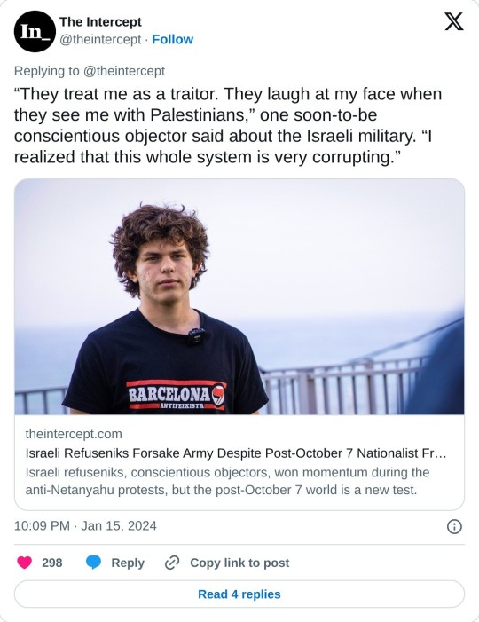
Elam’s views on the Israeli–Palestinian conflict were clarified by his activism, which had taken him to the occupied West Bank and brought him into contact with Palestinians, whom he befriended. His stances were hardened not only as he watched the Israeli military’s treatment of his new friends, but also in how the soldiers viewed him. “They treat me as a traitor. They laugh at my face when they see me with Palestinians,” he said. “I realized that this whole system is very corrupting.”
“They treat me as a traitor. They laugh at my face when they see me with Palestinians.”
As he concluded that he planned to refuse, Elam sought out others. Even Israelis who opposed the occupation sometimes didn’t understand: Some soldiers seek to not serve in combat units, but even were incredulous at the idea of full refusal. It wasn’t surprising: Israeli education laws require preparing students for IDF service.
The expectation that everyone serves is so pervasive that few register that this makes them part of a system that oppresses Palestinians. “A lot of the Israelis that do not consider that is because they were born into Israeli society, a society that from kindergarten teaches us about previous wars, about Israeli nationalist heroes,” Elam said. “I would almost say I cannot blame the people who do join the army. But at the end of the day, us refusing is us attempting to bring this up into conversation to make more people do it.”
Yona, another soon-to-be refusnik who asked The Intercept to withhold her last name because of the sensitivity of the issue, said that as more people over the past year have connected the erosion of democracy to the occupation, Mesarvot has played a pivotal role in providing community, demystifying refusal, and preparing young Israelis for the consequences.
“There are plenty of people who are, you know, at the level where they could afford to do it and just don’t consider it as a possibility or don’t consider it as something viable, as something worthwhile,” Yona said. “And that’s certainly something that Mesarvot helped change — bringing that voice, making people realize it exists. It’s something people do proudly, it’s something that is important, and it makes noise.”
Democracy and the Occupation
For Mitnick, Yona, Elam, and others, preparing for refusal with groups like Mesarvot doesn’t come without precedent, nor in isolation. The Israeli teenagers have spent much of the past year protesting the Israeli government’s anti-democratic moves, its treatment of Palestinians, and the occupation more broadly.
Last February, Mesarvot activists were present when protesters traveled deep into the West Bank villages of Masafer Yatta to protest the eviction of some 1,300 residents from their homes. The Israeli military had declared the area a closed “firing zone” — ostensibly for security and training purposes — decades before, with the aim of getting the Palestinian villagers out. With the push to expel residents last year, the activists showed up in violation of the law, since entering closed zones was forbidden.
The group also organized protests on Israel’s side of the Green Line, which roughly demarks Israel’s internationally recognized borders from the occupied territories. In May, Mesarvot activists gathered at Beit Sokolov, a building in Tel Aviv which houses the Israel Journalists Association, in honor of the anniversary of the IDF’s killing of Palestinian American journalist Shireen Abu Akleh.
The following month, as members of Mesarvot demonstrated in memory of Sarit Ahmed Shakur, an 18-year-old victim of a homophobic murder, a member of the group said an activist was attacked by undercover police officers who tried to confiscate a Palestinian flag. The group said the activist was arrested after he tried defending himself and was subject to “contemptuous and degrading treatment, misogynistic, homophobic and transphobic curses.”
With protests against the government’s seizure of the judiciary swelling nationwide, Mesarvot gained steam, connecting the refusal to serve with Israel’s anti-democratic turn. While the protests had come as a surprise for much of the outside world, the country’s left wing had long since warned that the occupation, holding millions of Palestinians in stateless subjugation, was bound to bring authoritarianism creeping back into Israel. Now Mesarvot activists were among the small minority of Israelis connecting the erosion of democracy with the occupation itself.
“The dictatorship that has existed for decades in the territories is now seeping into Israel and against us,” said a September letter by 230 Israeli teenagers announcing their forthcoming refusal to join the IDF. “This trend did not start now — it is inherent to the regime of occupation and Jewish supremacy. The masks are simply coming off.”
The teens had planned an event at a Tel Aviv high school to declare their refusal publicly, with the support of their principal. The school’s board of directors tried to block the protest by suspending the principal and canceling the event. The principal resigned in solidarity with the teens, and they hosted the event anyway, in front of a crowd with additional hundreds more. Since then, at least 50 more young Israelis have signed on to the refusal letter and, in recent months, some of the signatories burned their conscription orders as they announced their refusals.
“Very Militaristic”
Since October 7, Israel has maintained a widespread crackdown against dissenters, particularly against Palestinians. Communications Minister Shlomo Karhi pushed in October for the arrest of those deemed to be a threat to the “national morale.” Later, he tried to sanction Haaretz, a liberal daily newspaper, for its criticisms of the war effort in Gaza and for purportedly being a “mouthpiece for Israel’s enemies.” Israeli police chief Kobi Shabtai said in mid-October that there would be “zero tolerance” for anti-war demonstrators — threatening to send them to Gaza.
There was little tolerance. Officers arrested protesters at will, including those who’d lost family members in the October 7 attack. In early November, Israeli forces arrestedOpens in a new tab former member of Parliament Mohammad Baraka, a Palestinian citizen of Israel, who was on his way to an anti-war protest, along with four other protesting Palestinian politicians. Meanwhile, Israeli police have pursued at least 250 prosecutions — largely against Palestinian students, largely for social media posts — targeting dissenters. This weekend, Israeli police cracked down on anti-war demonstrations in Jerusalem and Tel Aviv, detaining a handful of protesters and throwing some to the ground.
This is the atmosphere, the post-October 7 world, that the activists of Mesarvot find themselves in. Yet few have wavered. Support, Elam and Yona both said, especially from the international community, played an encouraging role as they continued to tie their wider protests to their refusals. “It strengthens me, makes me feel less alone,” Yona said. And she sees their protests as part of a larger struggle for dignity and equality being led by Palestinians.
“Israeli society right now is very militaristic,” Elam added. “I want to say to the world that peace and anti-apartheid, anti-occupation activists do not feel safe. A lot of them have been attacked, have been doxxed, have been threatened, arrested.”
Elam singled out the arrests of Palestinian citizens of Israel, often for terror-related charges linked to little more than denouncing the Israeli war on Gaza. “Someone sees that the police arrest people because of online posts about this war, that is an issue that should bring up massive protests to the extent that we saw against Netanyahu,” Elam said. “We cannot say that we live in a democratic country when not only people are being silenced, but people are being actively arrested and oppressed for only saying stuff online.”
Now more than ever, the teenaged activists of Mesarvot see themselves as but one aspect of a movement, just one way to pierce the bubble of repression and nationalism surrounding Israeli society. They want their movement to grow and for the larger movement for democracy and justice to grow, too — to regain and then sustain the momentum they’d gotten before October 7.
Resistance is out there, Yona said. That’s what the refusals to serve in the IDF can show. She knows because it showed her a path to more than merely joining a movement. “It makes you feel like you’re not just taking on the mantle,” she said. “You’re doing something that is even more important in my eyes, which is working towards an equal society for everyone who lives between the river and the sea.”
Update: January 23, 2024
Tal Mitnick was sentenced to another 30 days behind bars on January 23, according to Mesarvot. Before returning to prison, he tweeted in solidarity with a Cypriot conscientious objector. “International solidarity between us is the way to fight against oppressive systems in each of our countries,” he wrote.
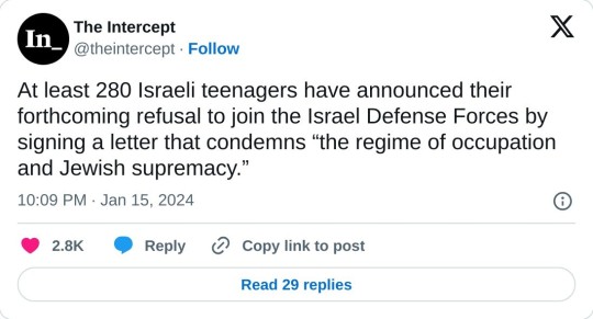
At least 280 Israeli teenagers have announced their forthcoming refusal to join the Israel Defense Forces by signing a letter that condemns “the regime of occupation and Jewish supremacy.”
#article#transcript for articles from screenshots#please know the images/ads/links for other articles are not included in the transcript#anytime there was a hyperlink in the text. opens in a new tab was added. i believe i eoved all instances of that phrase#but if i missed any please let me know! im doing this on my phone so
20K notes
·
View notes
Text
want to set up a geocities for this walkthrough (12k words currently) plus any other walkthroughs i might write in the future but that would mean having to learn how geocities works
#can we just make all walkthroughs mobile accessable with no ads#plus different contrast settings; alt text on images; zero ai involvement; noob/child friendly;#working hyperlinks; consise wording with no grammar errors; coloured text for ease of comprehension (toggle on/off)#is that too much to ask#okami
1 note
·
View note
Text
Inspired by this post by @thanergetic-hyperlinks, I present to you
Tessellations of the Nine Houses
(Or "I can't really draw figurative art so my Locked Tomb fanarts are geometrical vector drawings")
"A tessellation or tiling is the covering of a surface, often a plane, using one or more geometric shapes, called tiles, with no overlaps and no gaps." — Wikipedia.
Making tilings themed after each necromantic House seems obvious: for each House you pick a tile with the same number of sides as the number of the House; but this does present some challenges for some of the Houses.
note 1: this might give the impression that I first decided on the symbols and then found patterns to match them in a very organized and motivated manner; in practice it was much more chaotic and multidirectional, the patterns informing the symbols as much as the symbols informed the patterns; this is fine since symbolism is entirely associative and arbitrary anyway
note 2: I added alt-texts for all the images, but I have no idea of how to properly describe abstract geometric art; if you feel you can do a better job than I did, feel free to put your fingers where your mouth is--wait, hang on-- I mean feel free to provide better descriptions if you can
note 3: looking forward to the geometry nerds explaining to me how I got basic geometric details wrong, friggin nerds
The First House
The First House seems obvious, as a shape with one side is an ellipse (of which the circle is a special case). There's just one problem: ellipses do not tile the plane. No matter how much you stretch them and deform them, the very nature of ellipses means you'll always have gaps or overlaps.
So we cheat and we work with overlaps: turns out there is a history of tilings that use circles as a construction pattern, then turn the overlapping sections into the actual tiles. Such patterns have been used extensively in European and Middle Eastern art, and have also been associated with the New Age movement, so it fits Jod's style perfectly. And so we get this:

The different cells correspond to different House colors, with the resulting gothic stained-glass appearance quite in line with the Roman Catholic Empire vibe Jod is going for. The overlapping circles convey the intricacy of the relation between the First House and the eight other, both autonomous from it yet intrinsically part of it.
The Second House
There's a variety of geometrical shapes that have two sides, but most of them don't tile the plane, altho there is one that does — if we take a crescent shape and slightly thicken it so that the inner and outer curves are identical, we can do this:

The waving pattern is of course evocative of the flag of conquest which the Cohorts of the Second House have planted on many worlds.
The Third House
With the Third House things get a lot easier, because equilateral triangles are one of the three regular polygons (where all sides are the same length and all angles are identical) that tile the plane all by themselves without needing any other shape! Which however doesn't mean we have to be boring; we can have a little bit of fun:

Flowers for the beauty and ionizing radiation warning signs for the rancid vibes.
The Fourth House
Squares are the second regular polygons that tile the plane by themselves, so again our job is easy here, altho we still want to not go for the easiest option in order to be able to work in some symbolism:

The four big navy squares with a small white square at the center of course evoke the number five and the shadow of the Fifth House's regency over the Fourth.
The Fifth House
Regular pentagons do not tile the plane, so we have to use a more unusual shape — there are many options, but obviously we want to again pick one that offers some interesting numerical symbolism:

The cross-like patterns of course bring up the number four and the hold of the Fifth House over the Fourth. As for the crosses themselves and the fact that they appear to be made of wooden stakes, well uh… Abigail Pent, Vampire Hunter??? She does have Van Helsing vibes.
The Sixth House
Hexagons are the third and last regular polygons that tile the plane on their own. But this is the Sixth House we're talking about, things need to look orderly but in a convoluted way. So how about multiple levels of recursion:

The apparent complexity of the pattern is created by different orientations of a small number of elements, either 3 irregular hexagons, or 1 patterned regular hexagonal tile, depending on how you look at it, in line with the kind of hermetic scientism one imagines the Sixth House indulges in. The result is those apparent three-dimensional elements and emerging higher-order patterns, including that of ꙮ, the Multiocular O found in exactly one word of one 15th century Old Church Slavonic translation of the Book of Psalms ("серафими многоꙮчитїй" many-eyed seraphim).
The Seventh House
Regular heptagons do not tile the plane, but they don't need much tweaking to work, which is fine since for the Seventh House we want something deceptive yet simple (deceptively simple? deceptive in its simplicity?):

Hearts for the beauty, snake scales for the poison [the Seventh House is on Venus, the planet named after the Roman Goddess of love, but etymologically "Venus" is actually the same root as "venom", and of course "Septimus" resembles "septic" — tho in that case there's no etymological connection, it's just a happy coincidence].
The Eighth House
Octagons do not tile the plane, but they come pretty close, so we can give the Eighth House a simple, stern, but slightly threatening pattern:

Boring sterile bleached temple mosaic, with just a little bit of passive-agression, a perfect fit for Evangelical Christians Tumblr puritans the Eighth House.
The Ninth House
And so we reach the Ninth House. Now the thing about the Ninth House is that, even by imperial standards, they're huge freaks, like they're completely unhinged heretical weirdoes. So, when it comes to their tiling, we need to get weird, like, a lot weirder than we've been so far, and this will require some context, so get ready because now we're officially going on a wild tangent.
So far all the tilings we've seen were periodic. That is, they were drawing a pattern that repeats itself indefinitely in all directions.
But starting in the 1960s, mathematicians began to study aperiodic tilings, tilings that don't repeat; you can keep expanding them forever and never exactly find back the original pattern you started with. The first mathematical proof of such a pattern was made in 1964 and theoretically required 20,426 distinct tile prototypes… This was soon refined to just 104 tile prototypes, then a mere 40. By 1971, it was mathematically demonstrated that you could make such a pattern with just 6 tile prototypes.
Except that was a lie.
Note that I said mathematically demonstrated. As it turns out there was an aperiodic pattern with just 5 tile prototypes, known as Girih, that had been used in Islamic art… since at least the 13th century — but it had historically been treated merely as an element of architectural design, and its mathematical properties weren't studied until 2007.
Then in 1973 this guy Penrose came along and demonstrated you could make an aperiodic tiling with just 2 tile prototypes. So now the goal was to find the ultimate aperiodic tiling, the one that would use only one tile prototype. Given how fast the field had progressed so far, it seemed that this discovery was imminent.
It took 50 years.
Not only that, but it was the work of amateur mathematician David Smith who accidentally discovered a 13-sided polygon that could make an aperiodic tiling all by itself (he then had his discovery checked by and co-authored a paper with a number of professional mathematicians).
EXCEPT THAT WAS A LIE AGAIN.
In turns out an aperiodic tiling using only one tile prototype had already been found… in 1936. But since the study of aperiodic tilings only started in the 60s, its significance in that domain wasn't understood at the time. It was seen as significant, but for an entirely unrelated reason: it was the first demonstration of a polygonal shape that needed only two copies of itself to completely enclose the original one — many mathematicians before that point thought the minimum possible was 3 (think of the Triforce from Zelda, with one equilateral triangle completely enclosed between three other identical triangles).
And coincidently, that shape happens to be a highly-irregular nonagon [yes "enneagon" is """technically""" more correct but "nonagon" has been used since the 17th century and is more common and it has Nona in it and Nona loves you]. So here it is, the Voderberg tiling, the freakish freakish tessellation of the Ninth House:

Like you see this and you're like "what is this, what is that thing, that's not a tiling, what the fuck is that" — but it is, it is a tiling, you can keep adding the freaky polygon and it keeps expanding outward forever, with no gap, no overlap, and with an ever-changing pattern. A double-spiral radiating outward, for Anastasia and Samael, Anastasia and Alecto, Alecto and Harrowhark, Harrowhark and Gideon.
And if you were thinking that this last one must have been significantly harder to draw than the other ones, you would be correct.
447 notes
·
View notes
Text
With the uncertainty about tumblr’s future and people talking about other social media, I really really recommend Pillowfort.
It has long-form text capacity, with a tumblr-like layout and tags. It has image hosting. It has the ability to hyperlink things in text. It has a threaded comments section to talk to both OP and others without getting confusing or jumbled up. It had communities before tumblr did!—and honestly I like Pillowfort’s implementation better. It has post-by-post privacy options. It has no ads, and is funded by users, not the whims of petty CEOs. AI generated content is entirely banned.
It is hands down my favorite social media platform I’ve ever used. I’m active there, and it’s a great community. Crafting, photography, book discussion, and aro and ace discussion are particularly vibrant. As well as furry artists.
I have invitation codes if anyone wants a Pillowfort invite, to check it out and maybe crosspost some of your tumblr posts you like!
377 notes
·
View notes
Text
Born Archivist AU Wrap Up Post
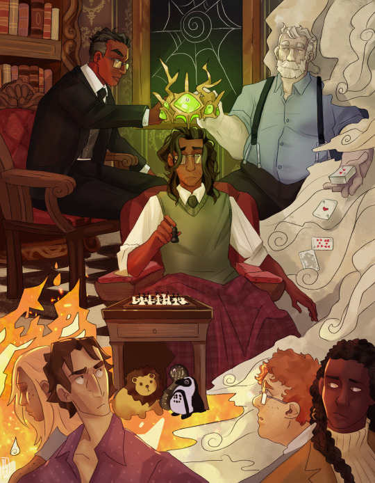
Image ID below the cut. Art by @dcartcorner !
Series Summary:
Agnes Montague was a failure, the ritual poorly planned and even more poorly executed. But for the Ceaseless Watcher and the Avatars who have learned from this mistake--perhaps things could be different...
...Jonathan Sims, John as he prefers, is eleven years old when Mr. Bouchard comes to see him.
A massive thank you to you all. For reading, especially for commenting, and for all the support in getting this over the finish line.
If you're interested in reading or seeing more art, please check out the links below the cut. You do need an Archive account to read!
My ask box is open, I'd love to chat theories, questions, and thoughts anytime! Please don't be shy!
What to Know:
Child of Illumination is a fic series with three primary story arcs that follows John Sims from age eleven to his time as Head Archivist of Magnus Institute after being adopted by Elias Bouchard and Peter Lukas.
All three main arcs are rated T and suitable for those who can enjoy the same sort of content as in the podcasts. CW's are provided on individual chapters.
The Main Story:
Part One: Child of Illumination:
Agnes Montague was a failure, the ritual poorly planned and even more poorly executed. But for the Ceaseless Watcher and the Avatars who have learned from this mistake--perhaps things could be different...
...Jonathan Sims, John as he prefers, is eleven years old when Mr. Bouchard comes to see him.
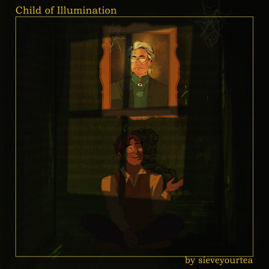
Image Id at the end. Art by @sarcasticscribbles!
Part Two: Shadow in the Hunting Grounds
Agnes Montague was a failure, the ritual poorly planned and even more poorly executed. But for the Ceaseless Watcher and the Avatars who have learned from this mistake--perhaps things could be different.
Jonathan Sims, John as he prefers, has lived with fathers for six years. Like for a lot of other young people, University presents a time for self-exploration, and a first occasion of being out on his own without someone...Watching quite so closely.
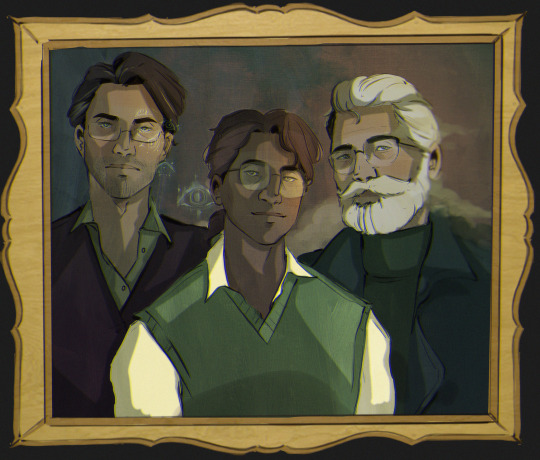
Image ID at the end. Art by @sarcasticscribbles!
Part Three: Blood of the Covenant
Agnes Montague was a failure, the ritual poorly planned and even more poorly executed. But for the Ceaseless Watcher and the Avatars who have learned from this mistake--perhaps things could be different.
Jonathan Sims, John as he prefers, has spent three years working as a Lead Researcher at the Magnus Institute. For someone for whom home has had a less than solid definition, the Institute offers a chance for safe place for John to finally answer the questions that have followed him for as long as he can recall.
Being able to work alongside his father is simply an added bonus, of course.
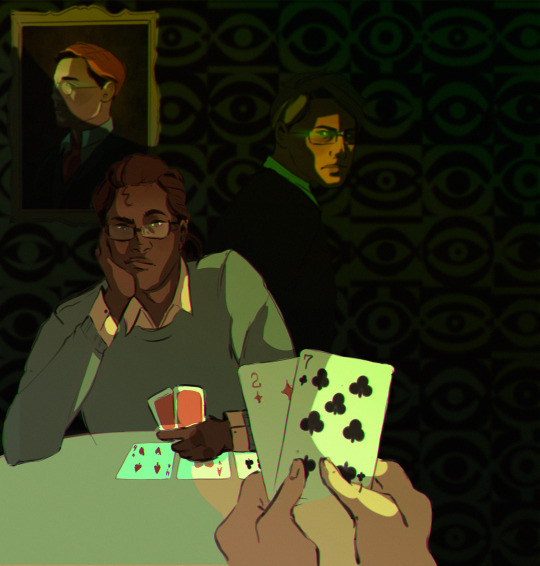
Image ID at the end. Art by @sarcasticscribbles!
Art:
COI wouldn't be what it is without the amazing artists who have brought it to life!
Official Scene and Summary art is by @dcartcorner who does exceptional work across the board.
Official Covers for all three main stories are by @sarcasticscribbles who's art is one of the reasons I started to engaged in fandom at all!
Official additional art of some choice scenes as done beautiful by @mxwhore who I cant thank enough for their amazing work!
Other creators who have made art related to COI include @obscuravoid, @the-awful-dread-that-leaves, @novae-viking, @basilikum7, @hemi-demi, and @moominmammaonhero1n!
Please, go and show them some love! I will post an Art-chive into the series on A03 as well to link back directly to all of the amazing work that's been made! If you've made something and don't see your name here, please let me know!
Additional Content:
Part of the fun of the series are the additional side fics. They cover a range of topics from John's interactions with various people, time spent with Peter and Elias, and the horror content that makes TMA what it is. There are all flavors, from G to E, and all can be found at the hyperlink above.
These are NOT necessary to understand the story and do NOT contain critical plot points. They're simply for fun! .
A special shoutout to @selinko for a lovely set of memes that absolutely made my day and continue to do so!
FAQ's:
The following are just some things that have come into my inbox the last couple of days in particular!
Can I make fanart of this story?
Sure! Please tag me, I'd love to see and spread the love!
Can I make other fanworks of this story?
Sure! Same as above, please tag me. I'd love to see and spread the love!
Will you be writing more?
I may do additional side pieces, but the main story is happily done. I have a total of 105 fanfics, 104 of which are Magnus if you're interested!
Can I send you questions/thoughts/songs/things that made me think about the story?
Yes, my ask box is open and there is an anonymous option. I will delete rude asks, but otherwise am happy to answer. Any spoilers, I'll put below a bar.
Image IDs:
Cover Art: A painting showing John Sims at the center, playing chess with an unknown opponent. On either side above him are Elias Bouchard, surrounded by books, and Peter Lukas, holding a stack of playing cards. Together, they hold a crown of gold and green eyes over John's head, framed by a spider-web window. At John's feet are three animals--a lion, a cobra, and penguin, looking up from a base of fire that shows Agnes Montague, Tim Stoker, Martin Blackwood, and Sasha James respectively.
First Cover: Cover Art of John giving a statement to Gertrude the portrait. He is 11-13 years old, wearing square glasses and talking to her as if she is an old friend.
Second Cover: A family style portrait of Elias Bouchard (aged around 40), John Sims (aged seventeen to eighteen), and Peter Lukas (aged around 50) years old.
Third Cover: John Sims and Peter Lukas are playing a round of cards. John is debating whether or not to be on this hand with chin resting in his hand. Peter is holding a 2 of diamonds and a 7 of clubs, considered the worst draw in Texas Hold 'Em. Elias Bouchard, with a faint green light around his eyes, watches from behind John's shoulder, the whole viewed over by a Portrait of Jonah Magnus with the same faint green light.
Thank You!
Thank you all again for letting me share this story and journey with you. After one year and nineteen days of writing, I am very happy and rather proud to say the series is complete. It's my longest fanworks project by a mile and wouldn't have been possible without all of your lovely support.
With all the love in the world, Sieve signing off.
#tma#the magnus archives#peter lukas#jonathan sims#elias bouchard#my fic#born archivist au#wrap up post
348 notes
·
View notes
Note
Hey there!
Can you please kibbie type txt?,
Im very confused about their kibbie type especially yeonjun and beomgyu.
TXT Kibbe Body Types ♡
finally figured them out! enjoy the analysis. this time i used more hyperlinks not to crowd the post with images.
yeonjun - PURE CLASSIC
such a rare type! no wonder it's so hard to find his ID, plus his stylists dress him like a gamine (berets + wildly dyed/stripe hair = very G). but in reality, he is the clean aesthetic. a man with a perfect face and moderate to tall height. not an extremely towering frame like soobin, nor petite. perfectly balanced. Ns are also moderate and he has a little kibbe width, but N clothes usually give him sweater paws and pile on the body, making him look like another person. so, no blunt yang, more classic = oval (his face especially). where gamines have bones like short Ds, classics are "tame" sharp yang. it shows in his squarish shoulders. he's not a DC, though. his clothes are best 100% symmetrical like he is. at 1st i thought he's a gamine, but cropped lines are meh. a classic only needs a simple dress shirt to seduce you. gamine chaos patterns are too cluttered.
his red carpet looks rarely miss the mark: most regular evening menswear/suit and tie is all pure C. yeonjun's ideal look is: restrained. when you see him in a trench coat (the DC and D item incarnate), it's already too much to handle. put it on DC taehyung, he walks like he owns it! pure C has a less powerful frame and goes for vests > coats. as for ruling out the other subtype: soft classic morphs his face into someone else like romantic does. we're looking for "that's so yeonjun". he has lip injections, his mouth is much more balanced and less yin/pouty in its natural state. instead, he is the true midpoint of all the 13 types. a simple head to toe tux boosts his vertical line and matches his proportions well. gentlemanly clarity of lines.
huening kai - FLAMBOYANT NATURAL

signature fur coat: that's how you spot the N types! hyuka has width with added narrowness throughout his body, and quite some vertical at 6'0. he looks powerfully built with a rectangular, zero curve bodyline, like a block, straight down the torso and legs. his face's angles are not sharply, intimidatingly taut like a dramatic: they look softer, but it's actually N bluntness (think Gigi Hadid). same with the shoulders. not angular and bony like D, G, and C types. FN is a friendly giant, and can look "cute" up close. mind you, he just turned of kibbe-typeable age (22+). he still matures into his type.
besides wearing heavy, hard-hitting fabrics well, he thrives with a head to toe look. doing line breaks gamin-style goes against his harmony. dramatic and classic are too formal, awkwardly narrow or off size. D and SD fall flat, looking so serious. FN needs room to breathe, fluffed, bountiful hair and knit/rougher textures: bomber jackets, jeans, so charming on him! vice versa, romantic styles make him look like a child; he wears R fabric and curls often because pure R is TXT's concept, but it needs a bolder approach. SN yields a waist emphasis he doesn't require (belts do nothing for FN), and pure N is just regular-degular, doesn't really do it for his face. add some dramatic structure and deep colors and it works perfectly.
beomgyu - SOFT CLASSIC

D and N clothing are oversized on him and don't make his face pop, while R and G styles have too much distracting detail or become fuzzy: he's too tall to be that yin, either way. that leaves us with classic! his face is taemin-like, very lavish, but he has a more streamlined frame than a small TR, which would have been my first thought for beomgyu. compare the hands, though: TR taemin has soft, full, small fingers (R), while beomgyu's hands are elegantly sculpted, neither small nor huge (C). typing hands is underrated (pics easy to find + hardly any surgeries/filters/makeup on them)!
many classic category clothes really do look so neat on him, it's amazing. there's a reason why he's only marginally smaller than pure C yeonjun, who is his type neighbor. but beomgyu heavily benefits from SC waist emphasis/tucking shirts while pure classic and dramatic classic are not fitted enough, and even too long for him. asymmetry and leather edginess (= for sharp subtypes + dramatics) is not his cup of tea. yin subtypes are always less vertical, need gentler fabric, more flowing hair. gosh, soft classics are such perfect creatures.
taehyun - FLAMBOYANT GAMIN

just like his infinitely versatile fashion style, taehyun is an unpredictable mix of many types like one would expect of an FG. e.g. rounded jawline with sharp lip corners: a wild combination of essences. we see some soft, deer-like, youthful R features, some narrow/angular D in the bones, some muscly N tonedness (that already tells us in which subtype direction it goes). compact, but chiseled. like a petite dramatic type. not ultra small, femme-leaning, waist-emphasis-heavy like SG, and too much natural yang for pure G. pure G is only D + R, while FG is actually D + R + N.
the way taehyun drowns in casual clothing baekhyun-style already told me he's a gamine at one glance. the way he can wear showy TR clothing with insane decor proves his flexibility but penchant for small detail. patterns are a Gs best friend, as is the highschool uniform. line breaks work 100%, but he can also do a heeled head to toe black - FG has an elongated D undercurrent. this ID has the widest fashion range. taehyun reminds me of jonghyun a lot, and FG is his type. and a little j-hope frame-wise, FGs may have incredibly varied features but among each other, they are surprisingly familiar!
soobin - SOFT DRAMATIC
any D type is hard to miss. at 6'1, soobin has to be D, SD, FN; tiny chance of DC. next to broad FN hyuka, his narrow D bones and rectangular shoulders are obvious, and he eclipses the classics yeonjun/beomgyu. baggy natural styles hide him, the pants wind up too wide. gamine with its prints and patterns becomes a fuss since you have to size up the clothing to fit his yang proportions —mixed G materials don't work either — and the classic tux is too short. romantic type, 0 chance. (kibbe declared some 6'1 celebs as Rs in the past... they're mistypes. Rs are small/moderate as they are yin, the opposite of D. they could never border 6'2, ever).
and, easy tell: most male SDs are infuriatingly underdressed, and aren't fazed by diamonds whatsoever. stage uniforms, fantastic on soobin! his stylists try to put dark C clothes with long trousers on him, give him the gamine fuzzy bowlcut, and call it a day. little do they know who's hiding underneath all that... a stunning SD slayer. i did consider pure D, but if you put some nice silk fabric on him, it's just beautiful. only harsh angles all the time gets boring, even if it does have its desired effect. he can handle accessories so well, too. pure D cannot. if you upsize TR clothes with glitz and glam, he rocks it.
thanks for requesting @miraculousmayad! i love txt.
#tomorrow x together#txt#kibbe types#kibbe body types#yeonjun#huening kai#hyuka#beomgyu#taehyun#soobin#this took forever#apologies for the answer delay#ask#cub mail 🐅
55 notes
·
View notes
Text
~Let's talk about credit~
(not financial credit trust me you don't want to take financial advice from me lol)
No, today I am inviting y'all to the table to talk about the importance of crediting other creators in fandom!
Because, listen. We don't have a peer-review system. We don't have to submit our stuff to a plagiarism checker or go through stringent editing when shitposting on tumblr; we operate in an honor system of crafting folklore using our favorite blorbos, and that means that inspiration and using the specific words and images from canon creates a grey area on what ought to be credited, and how to do it in a way that creates a solid, strong community.
Here's a little of my philosophy and how I give proper credit where it's due, so I figured I'd share them to hopefully encourage others in making sure no one out there ends up becoming fandom's James Somerton
1. Links are your friends, use them enthusiastically
Drooled over a gifset that made you write a poem? Read a fic that made you pull out your embroidery hoop? Saw some art that made you write a song? Link to the original! Tag the original artist, hyperlink to the giffer, share the fic via the amazing shortcut button on Ao3, it's what those creators deserve! Even if it's a shitpost, that creator is where your idea started, and it's the right thing to do to share directly where your audience can connect with the person who inspired you.
This holds INFINITELY true if you are directly quoting someone. If you've used someone else's words to create your own work, link back to the original. No one wants to be sent a fic or a funny post on tumblr and then feel the sinking pit in their stomach when they realize that post is their own words with someone else's name on them.
2. Ask for permission when you can
Now, the reason I threw the addendum on this with "when you can" is because knowing when to ask for permission is more of an art versus a science. I myself have written more than one fic inspired by art where I didn't reach out to the artist before I shared the fic because I had no contact with them (the joys of me refusing to touch the garbage that is the bird site). BUT this is why point number one is to always link back to the original inspiration, because I believe that should always be the bare minimum.
THAT BEING SAID.
If you have a way of contacting the original fellow fandom person who inspired you? Reach out and ask them if they'd feel comfortable with you creating something! 999 times out of 1000, they're gonna be over the MOON you want to create something inspired by what they made, and they'll be really fucking pleased you reached out to check.
3. Ask yourself: is this a "two cakes" situation or am I putting my name on someone else's cake?
This is another one that can absolutely fall into a bit of a grey area. I have written many a fic that started out with me reading a take or a fic that went in a WILDLY different direction from what I was expecting or wanted, and I went "okay, fuck it. I'll write my own." And that's absolutely been a great motivator for me to start a project!
HOWEVER.
That is me creating a different flavor of cake, putting my own frosting on it, and probably adding something weird like lemon zest and instant coffee for a lemonade cappucino chiffon that shouldn't work (but definitely does, trust me)
If I were to have read a fic or a take and then gone, "Oh, yeah, definintely, here's the same idea but now I've rephrased it juuust a little and now it's under MY username on my blog".... that's slapping a different color of frosting on the same cake and claiming it's mine. If you find yourself doing that, I really invite you to pause and consider why you felt the need to do so instead of sharing the original post.
Like, not to bring Shakespeare into it (they say, poorly concealing their icon), but fandom can be exactly like how Juliet views love. Sharing joy in what others have created absolutely can be as "boundless as the sea [...] the more I give [...], the more I have, for both are infinite". It does not take away from the joy your fellow fandom friends will have in your own original work to share the work of others.
4. Hyping up your inspiration is FUN
Finally, this is more of me going "no really, proper credit isn't going to mean people love YOU less" because I truly believe in the power of how much FUN it really is to give credit where it's due. I was buzzing for WEEKS in anticipation of publishing Objection! and The 'I Duoy' Newlywed Special because the marvelous @jackuntiljune had brainstromed with me on the name for the boat my boys eloped on. And I get so fucking giddy when I see someone comment on those fics about the name of the boat because I get to take a giant breath and go "MY FRIEND JACK CAME UP WITH IT, AREN'T THEY AMAZING?!"
If you practice giving credit where it's due, I promise promise PROMISE it will become a joy. It's FUN getting to bring more people into the sandbox to play, and I know I love it when there's more than one person out there I can yell at (affectionate) when I've been emotionally destroyed (again, affectionate) by a gifset or art or fic <3
Thanks so much for reading this far! I can't wait to keep sharing inspiration with all of you out there
133 notes
·
View notes
Text
TS2 CC downloaders & creators discussion recap
Under the cut is a recap of the feedback gathered from the comments, community replies and reblogs on this thread. Thank you for taking the time to give your input! I tried to organize everything clearly in categories, with what was most often brought up at the top of each. I hope I didn’t forget anything. If I did, or you feel I didn't do your point justice, or you didn’t get a chance to say your piece, feel free to comment (I can always make edits). The text in brackets [] is my own remarks that I'm adding to the report.
About CC in general:
The people clamored for clear swatches/pictures that show which file corresponds to which recolor, so we can pick and choose what to keep.
Many people would like creators to put their usernames in their file names (or object descriptions) so they are easier to trace back to later. Two creators had counterpoints to this. One who has a long username said: “as a creator, I don't like to be told how I should name my files (besides identifying the thing clearly, which I think we really should do). If I've made the effort to make a thing, take previews, upload it, write the post etc. Just spend 5 seconds of your life renaming the file to whatever is convinient to you, I'm not going to add 16 characters to each of my files to include my username (I still think that longer names = longer loading time).” The other creator said: “As a creator, I don't want to put my full username in tooltips (just SB) because some hair names are quite long and I do not have the time to re tooltip the names.”
On the topic of file names, many people agreed that creators should not put special characters and spaces in their file names, to optimize loading times. One creator clarified: “the filenames should always have _ instead of spaces, as apparently this allows the game to load them easier/faster [...] underscores should be the only kind of special character in them” [use the Bulk Rename Utility - see tutorial by @ilovethesims2cc].
Still on file names, a Mac user said they dislike when file names are too long because apparently long file names are enough for Macs to shit themselves [sorry if I misunderstood, never had a Mac].
Several people mentioned disliking poorly optimized CC (one person listed: “bulky for no reason, unused bump maps, comically large or duplicated textures, things that could easily be repo'd but are not”), one person pointed out: “There is no reason a TS2 object needs a texture bigger than 1024x1024 unless it’s a special case like a skybox.”
One person said they dislike when a CC post lacks basic text info about what the download is. On this note, another person said they dislike when a creator isn’t clearly stating what mesh their recolors are for.
Two people asked that creators state their stuff’s polycounts.
Two people said they dislike when the recolors for a piece of CC are only available merged together, as they want to be able to easily choose which they want to keep. On the other hand, someone who “takes all recolors anyway” said they would like creators to offer a merged version of their recolors [you can merge CC to reduce loading times using LazyDuchess’s CC Merger].
One person recommended avoiding just using “here” as hyperlink text, but instead describing what you are linking to, so that if the link gets broken we still have a chance to find the thing. In the same vein, they and another person advised against reliance on an image alone to give info about the download. As we know, images can disappear, and a Google search won’t lead to the item if your post has no text that Google can detect.
About the images that creators do show, one person mentioned a download not having a proper preview as their pet peeve. On previews, two people recommended that the piece of CC be clearly visible and the main focus. Two people said they like when a preview of the item is included in the archive (“helpful when looking through old CC”).
One person said they appreciate when creators give two download links to two different hosting platforms, in case one of them ever breaks.
One person asked for creators to always test their stuff before uploading [it should go without saying but we do see egregious things to this day]. Their pet peeve is “CC with obvious issues that can’t have been tested properly in game! Don’t just look at it in build mode or bodyshop, actually use the item in live mode. Have a Sim wear the clothing or use the object!” They pointed out as an example that some CC lights don’t light up. Someone else said: “if there are minor imperfections, that's ok! But let your downloaders know what to expect.”
One person said that they enjoy reading detailed descriptions of CC: “Share your inspos, what went wrong, tag the pieces you used if you are Frankenmeshing because I might want those items too! Creating and sharing is deeply personal, don't be afraid to share a part of who you are in your downloads if you feel comfortable doing so.” [If I may offer a slight counterpoint, I think detailed technical info + proper crediting should always be frontloaded. And then, in a separate paragraph, you can write about how you made this because your grandma used to wear something similar on those cool autumn days back when you were 6. But please, don’t expect your audience to have to parse through your life story to get the basic info they need to even understand what the download is.]
On subfolders: one person mentioned that they dislike when individual files are placed in subfolders; someone else said they don’t like many subfolders within an archive; a third person said that when downloading a ‘bulk’ CC pack, they dislike when each item has its individual subfolder (unless the object has dozens of recolors).
One person said they dislike downloads that include a large number of things that aren’t all part of a single coherent set.
One person said they dislike gift/mega packages that don’t give the possibility to pick and choose what you’re downloading.
One person asked that creators compressorize their CC, unless there is a good reason for not doing so, reason that should be stated [yes please! Use jfade’s Compressorizer, found on this page].
One person said they like when creators who make recolors give a link to the mesh they are recoloring whenever possible, even if the mesh is included.
One person mentioned appreciating when creators include base PSDs in their downloads [they were talking about hair specifically but I suppose it can be done for other things too].
About Bodyshop CC specifically:
Many people mentioned disliking when a piece of clothing lacks a fat morph (as one person put it: ✨“its literally bigotry”✨ [iconic]), or has a fat morph that's blatantly a quickly WSO’d afterthought. Someone said: “Absurdly shaped/clipping fat morphs that were most probably never tested in game before uploading are pretty annoying”; someone else said: “I make male content and am constantly flabbergasted by some of the UM Top fat morphs that make no attempt to align with Bottom items, or look completely ridiculous. [...] WSOs are a great starting point, but that's just it: a starting point" [I couldn’t agree more]. One person added that clothes should also have preg morphs.
One person really wants tooltips. Someone else further asked that creators give actually helpful tooltips to their recolors to make it easier to identify which recolor corresponds to which file [you can use CatOfEvilGenius’s Tooltip utility to give your recolors tooltips that correspond to their file names].
One person mentioned gaps in meshes being their #1 pet peeve [putting this in this section because I’m assuming they’re referring to Bodyshop CC].
One person asks that creators give their accessories unique BIN numbers to make them layerable with other accessories.
The same person would like creators to remember to delete the inapplicable ages in their accessories [this also goes for hairs].
The same person also appreciates when creators make custom thumbnails for their accessories, “especially for accessories that are not on the face”.
The same person said: “Accessories that are 'part of the sim' (like ears, tails, etc.) should be showerproof”. Another person had the same request: “Body part accessories (such as animal ears, tails, horns, wings) should be available for all types of clothing.”
One person appreciates when hair meshers specify if their hair is animated or not.
One person would like to see more hairs for toddlers and children.
For geneticized skintones, one person said they find it helpful when the genetic number is indicated in the file name.
About Build & Buy CC specifically:
Several people said they dislike when CC objects are set to an absurd price (like a couch for 1 simoleon) [this can be fixed with Pick’N’Mix’s Object Relocator], and two people added that they dislike when an object’s price isn’t congruent with their stats (like when an expensive bed has a low energy score). A creator further said: “whats worse is sometimes items are cloned from a very expensive item, and then the creator has reduced the stats shown in the description, but the bhav still has very high ratings, or sometimes it can be the other way around, an item might have been cloned from a cheap one, then their displayed stats are set to 10 but the bhavs still have low ratings”.
Three people said that they really appreciate when creators state which category their object is in and what the price is. One person said they appreciate when creators give info about how their object functions (“Is it just deco? Does it have hobby enthusiasm?” etc.). For complex objects, they like when there’s a video to show how it works.
One person said they dislike when creators place objects in categories that don’t make sense. Someone said more specifically that they like when objects are put in categories other than deco/sculptures or deco/misc.
One person said they dislike blank object descriptions or object descriptions that were left the same as that of the Maxis object that the piece of CC was cloned from.
One person said they don’t like when objects aren’t enabled for quarter-tile placement [can be fixed in simPe or with the Object Relocator].
One person said they dislike non-functional objects (like a sofa that’s a sculpture).
One person brought up two experiences they and their friend had with CC beds that didn’t have unique GUIDs and therefore would override other beds. In the same vein, someone else said they dislike when a creator forgets to mention that their CC is not custom but default and will override something in the game.
One person encourages creators to learn about the TXMT settings of objects (e.g. should an object be reflective?) and praised @pforestsims and @shastakiss for their CC in that regard. Another person said they dislike when an object is too shiny, which is also a TXMT setting.
One person said they dislike “transparent cut out textures”. [I quote because I’m clueless about this:] “I’ve seen this a lot on TS3 or other game conversions, where the texture has been imported without enabling transparency, and you get ugly squares around draw handles and such. Import the texture as DXT 5 and enable AlphaTest in the TXMT.”
One person said they like when 4t2 conversions have several subsets.
The Mac user among us would like creators to resize their walls and floors for Macs, otherwise they show up grey in game.
About lots specifically:
Two people said they like when creators show the floor plans of their lots.
104 notes
·
View notes
Text

✸﹕Introducing, CyberSpace and the Underground [antishifters dni]

NextGen, a corporation formed just a few minutes after the dawn of time. In association with Kronlock corp to bring your planet a next level experience.
NextGen is dedicated to bringing you connection, between planets, solar systems, and even galaxies. Whether that be in the form of telecommunication, space travel, or simple business transactions between two solar systems.
NextGen - Reach for the Stars

Are you ready to begin?
[yes] [no]
Step up onto the scanner, and line the crosses on your clothes up to the screen
Height - [63] .in Weight - [\] .lbs
+ Head - [\] .in
+ Neck - [\] .in
+ + + Shoulders - [\] .in
+ Bust - [\] .in Waist - [\] .in
+ / \ + Hips - [\] .in
+ + Thighs [\] .in
\ /
+ +
+ + Calves - [\] .in
Scan complete, physical body registered.
────── ✦ ──────
Lay down in the link bay for your brain scan.

Scan complete, soul registered.
NextGen thanks you for your patience
[Worker discretion, all data collected here can only be viewed by official NextGen/Kronlock workers above level five. Soul drives are stored in secure off-world facilities where your shell will be created. In no circumstances will your drive be viewed by anyone outside the corporation. Upon the unlikely event that it is damaged, destroyed, or stolen it will be immediately replaced and the emergency shutdown failsafe will be activated, deleting any data stored on the drive]
────── ✦ ──────
Congratulations! Your registration is now complete, you are officially a NextGen citizen and/or worker! You can collect your identification badge and other documents at the reception on your way out. Housing is freely provided to any NextGen worker, you will find more detail in your documents.
_________________ 007 - 682 Identification badge
╭━━━ ★ ╮ Name ; [\] NextGen X
Age; 18 Gender; Female
Model No°; EX3-47 Pilot
╰━━━ ★ ╯
reg no° 088-682-47_________________
007-682 Documentation
Homepage
Welcome to your new life! As both a citizen and worker for NextGen, you get added perks (only apply when in NextGen branded planets)! Which would you like to view first?
| Housing | | Job Details | | Benefits |
Your register number (also shown on ID) is important. It is what allows you to identify as a NextGen worker. Without it you cannot gain access to ship controls or NG centres.
007 represents year of creation and is not specific to you. 088 is your division, the team you will be joining. 682 represents your shell model and is not specific to you. 47 is your unique identification number. Do not forget it.
: P all I have for now. The page links will be hyperlinks to new posts
heres the rest of my concept images, this us going to be a sort of cyberpunk arcane dr with a little a lot of changes to plot


#shifting#shifter#antishifters dni#reality shifting#reality shifter#anti shifters dni#shift#quantum jumping#shifters#shiftinconsciousness#black shifters#shifting stories#space dr#space shifter#desired reality#arcane dr
21 notes
·
View notes
Text
Small guide to art posts on Tumblr:
I'm writing this because I keep seeing more and more beautiful art with absolutely terrible presentation on my dash. Presentation that is so bad it makes me sometimes not reblog the post even though I love the art itself. Call me superficial, but the presentation is part of the art as well and usually these posts also have less notes than you'd expect for the quality, so it's probably not just a me thing. That makes me sad and I want everyone to get the attention they deserve so here are my tips on how to present art on tumblr:
Put the image first, then add a small description - NOT the other way around. So many art posts have people yapping and yapping, only to then post an image in the middle of a wall of text. Don't do that! Have you ever been to a museum? Descriptions and titles should be small and below a piece of art. That's because you want to center the art as your main piece in your post.
If you have a long description or context, put it under a cut. Honestly, that is how everyone should do with long text. Nothing worse than making people scroll endlessly if they don't want to and it's also what makes people hesitate to reblog long posts. Short descriptions also give the benefit that people outside your fandom corner will be more inclined to reblog your art as well!
So generally keep text short and clear if possible. If you didn't draw the art, credit the artist above all else! I keep seeing people who commissioned something confused for the artist and it's fucking annoying. No one truly cares if you paid someone to draw something, everyone just wants to know who drew it. Also please for the love of all that is holy, do not pair your art with an embedded spotify link to a playlist. If you really want to share music, put it under a cut as well or in a hyperlink. Last thing you want is some ugly ass album cover to take away from your art!
No colorful fonts. There's a reason the majority of tumblr has ignored them ever since they were conceived (I remember the update! I was there!) and it's because it's ugly as sin and in the terms of artwork, it usually distracts from the piece as well, even if you try to color code. It's also the easiest way to out you as a newbie :D
If you have more than one page/piece in a post, consider the arrangement carefully. You do not have to accept the tumblr default - you can rearrange! In general, if it's not that many pieces, it makes sense to post them below each other rather than side by side. Make people look at your art that you spent so much time on! It's allowed to be eye catchy! If you have a more horizontal piece with short sides, consider adding a detail shot or two to lengthen your post so people don't accidentally scroll by.
Please, please stop using the huge title font in art posts, I beg you.
And that's basically it. In the end you can of course post however you like - it should please you first and foremost after all. This is just meant as tips and tricks of someone who has reblogged and posted art for over a decade on this hellhole of a page now. Some things newer people might not be aware of.
#I have mostly seen these things in the acotar fandom haha#but not exclusively!#acotar#acotar fanart#fandom woes
30 notes
·
View notes
Text
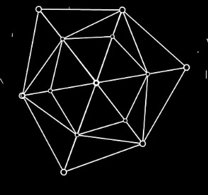
AvGeometry [An Analysis]
Disclaimer: This is a very short Analysis for Animation vs. Geometry by Alan Becker. I am not a geometer, (according to Merriam-Webster, a person who specializes in geometry) this purely for fun.
First of all, I will NOT explain everything in the video. I will just focus on answering a few questions to which I found the answer for. I also have some conclusions at the end.
I will leave the in-depth explanations of everything to those YouTubers. Also, I have linked my sources using hyperlinks.
So, let's get into it- shall we?
Let's start with-
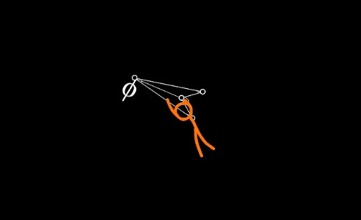
Which version of TSC is the main character for this one?
If you read my AvPhysics Analysis, you would realize that I named the TSC with the cowboy hat TSC_0 of Universe D.
Since the start of the AvGeometry video, I immediately realized that this is NOT the same guy from AvMath, since he didn't show signs of aggressiveness with phi Φ.
He's more curious versus the guy in AvMath who attacked Euler's Identity immediately. This is also the same guy who spawned in AvPhysics, TSC_0.
I think this MC is a TSC from a different Universe. I will call him TSC_0 of the AvG Universe.
Now you might ask yourself, why did I gave him the 0 designation?

Because the video ended with another TSC knocking at the point.
Now, you might argue, that this is not a perfect loop because there is a line below the point. While the start of the video, doesn't have that line.
You are right. Again, if you read my AvPhysics Analysis, I said that the TSCs in there are not stuck in a time loop.
It's just an infinite cycle that happens to different versions of them. Everyone spends only a short amount of time inside the singularity.
So the next TSC to arrive will not be TSC_0 but TSC_1.
How did TSC and phi Φ beat that Boss?
To start, let's define a few things. Click the hyperlinks to view my source.
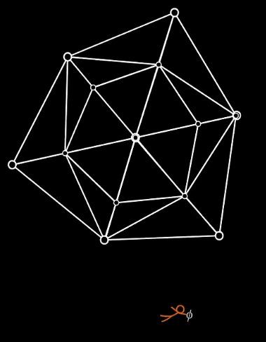
Polyhedron - is any three-dimensional figure with flat faces that are polygons. They intersect at straight, linear edges. The edges themselves intersect at points called vertices.
Tetrakis Hexahedron - It is a Catalan Solid with 24 isosceles triangle faces and 14 vertices. It is the d24 die. It is also a 3-dimensional polyhedron, not 4D.

Now, first of all, the Boss is not 4D. It is two Tetrakis Hexahedrons overlapping each other and rotates at different speeds.

Platonic Solids - a convex polyhedron that is regular, in the sense of a regular polygon. These are also 3D shapes. There are Five Platonic Solids
Note that this not the original image from the website, but I rearranged the rows to highlight my points. I also added the dice names, incase you're more familiar with DnD.

In fighting the Boss, TSC and phi Φ started with lines that has 2 vertices or points. Then they slowly moved to the Platonic Solids, eventually defeating the Boss using a dodecahedron.
The Boss had 14 vertices vs the dodecahedron that had 20.
Now, I can't really say why more vertices is superior. It could be structural integrity, or the idea that the universe's topology and shape, references the shape of dodecahedron.
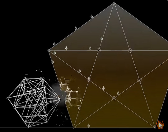
Or, that the golden ratio is the length from the vertex to the center of the dodecahedron, and is also the ratio of the diagonal of the pentagonal face as demonstrated in the video.
The Hyperdodecahedron and Singularity
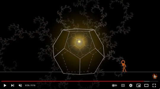
Hyperdodecahedron aka 120-cell is the convex regular 4-polytope (four-dimensional analogue of a Platonic solid.) It is the 4-dimensional analogue of the regular dodecahedron. It has 720 pentagonal faces and 600 vertices.
It's basically 4D dodecahedron.
According to ChatGPT, in higher-dimensional geometry and theoretical physics, singularities often refer to points or regions where certain physical quantities become infinite or undefined.
Here's how I see it. If that yellow dot is indeed a singularity, the only explanation I could come up with, is at some point, the hyperdodecahedron's infinite insides would shrink to a single point in its 4-dimensional space.
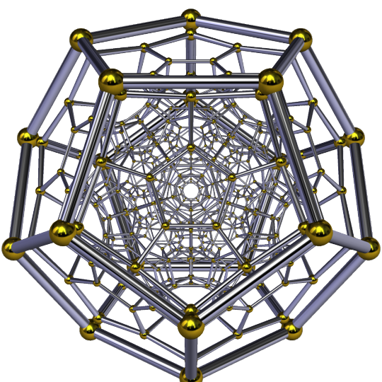
Fractals
Now I think these are fractals by I cannot be sure. Also, I couldn't get a definite answer as to how fractals would be relevant to singularities.
What I got from ChatGPT were related to the event horizon instead.
That irregularities of the event horizon might have fractal patterns or exhibit fractal characteristics in its shape when examined at a different (smaller) scale.
The visual and structural complexity of the event horizon evoke fractal-like qualities.
Now, this Analysis is a lot shorter, and also inconclusive. I did try my best. My brain is now mush.
#ave fan made#ava salad fest#alan becker#animation vs geometry#animation vs education#animator vs animation#avg second coming
36 notes
·
View notes
Note
Hi! Ive made a Terzobunny for Easter and I would like to add the nsfw parts for each of my posts. And i want to add the arts on ao3, not just simply post it on Tumblr.
My question is that how do you add the link without really adding that? Idk if it makes sense what im yapping, i just dont want to add that whole link to the post.
And also how "post" your (nsfw) arts on ao3? Like im new and i cant understand anything from it😭
Thank you in advance for your help💕
im answering this a bit late but, for the first part, I think you're refering to a hyperlink. A hyperlink lets you highlight any text you;d like and insert a link in it. All you gotta do is highlight your desired text on a tumblr post and this task bar shows up:

there you can insert a link that will be attached to the highlighted text.
now for adding images on AO3, here's a quick rundown of how I do it:
upload drawing and save as draft on tumblr.
open AO3
go through adding a new work and be sure to have it on the 'Rich Text'
click on 'add image' and this window pops up:

there you add the image link from the draft you saved on tumblr. make sure to click on it so you get the full image resolution. you can scale it up or down as you wish.
let me know if you need any clarification, or if something I explained didn't make sense!
17 notes
·
View notes
Text
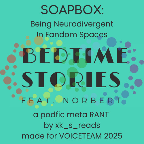
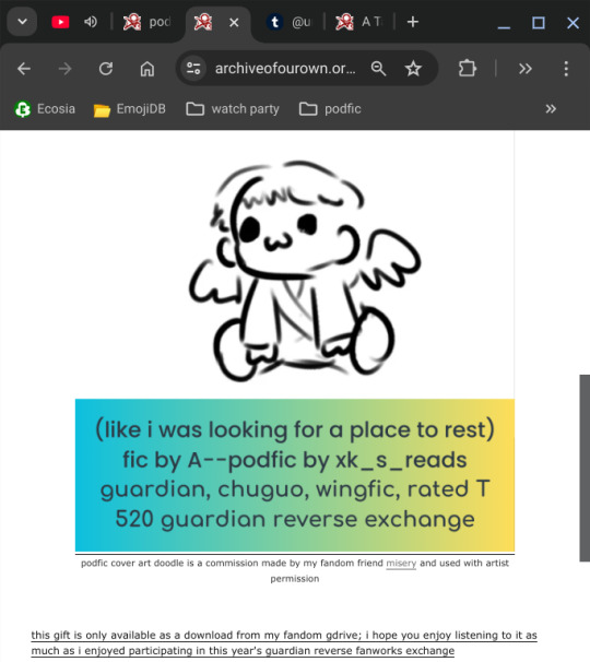
SOAPBOX: VOICETEAM 2025 CHALLENGE
"Write podfic meta about anything. Minimum length of 500 words or 3 minutes of audio." [me after more than 1hr 30min of expressing my thoughts and opinions on being neurodivergent openly in fandom spaces. Nailed It]
-----
SOAPBOX submission cover art:
-----
link to rant audio file--a bit over 01:30:00 in duration
(before you click on this. please be aware that the personal lore goes deep. i talk about things i have never shared in "public" fandom spaces before regarding my mental health, personal health, living arrangements etc. also please be cautious and kind to yourself and don't listen to it if these are triggering topics for you: suicidal ideation, cops/police, Baker Act, involuntary hospitalization, childcare, financial hardship, domestic abuse survivor, autism, adhd, audhd, neurodivergence, corporate america, underutilized university degree [if you happen to listen and think i missed any tags please lmk])
=====
things i talked about linking during the SOAPBOX recording
=====
link to rant text file
-----
link to creator ad text
-----
v1 cover art
-----
bonus materials i made ref to in both versions of the podfic, including the crack vid from which i sourced the cover image thumbnail
-----
gif that i included in v1
-> original post to which the embedded gif was hyperlinked
-> IMAGE SOURCE WEB ADDRESS: https://64.media.tumblr.com/5da3165c39e95c7e935504d5e7f07e6a/b9bc6e4c32b7b708-50/s540x810/934704ec71f47ed3f2d8787a30b9288553d563bb.gifv
-> what it looks like displayed in tumblr if i put in the link directly to the hyperlink tool (note that it is hyperlinked automatically to it's source)--MY QUESTION IS. IF THIS IS OKAY TO DO ON TUMBLR, WHY IS IT NOT "GENERALLY ACCEPTABLE" TO DO ON AO3?
-----
mentioned code snippet about how to embed hyperlinked gifs
-----
link to my podfic instructions (notes to self basically) on ao3
-----
transcript of email exchanges and my discord comments
-----
v1 of the podfic, which is no longer part of the exchange, so i will be sharing it publicly as i choose
-----
screenshare of the og post
-----
did i miss anything???
-----
okay so. i made version 2 so compliant and SO SAD AND PLAIN STORE BRAND OATMEAL AND BORING AND BITCHY
-----
this nonsense about to be my villain origin story
-----
UPDATE: i did get banned from the event in question btw. i'm coming to the conclusion that gift exchange fanwork events and i just don't suit
-----
end post
#xk_s_reads#soapbox#voiceteam 2025#VT25#voiceteam#a podfic RANT#long post#lost of links and embeds#neurodiversity#neurodivergent#neurospicy#autism#adhd#audhd#autistic things#asd#adhd problems#adhd things#neurodivergence#audhd problems
6 notes
·
View notes
Note
Hi, I'll preface this by saying that I'm a fan of your writing and this is not a rant at you specifically. It's something that I'm growing more and more frustrated with when navigating content/creations in the fandom (and other fandoms on here too tbh). Your posts just happened to be the ones I came across today and they provide a convenient case study into the matter.
I politely appeal for you to insert gif credit and sources in posts like these: https://www.tumblr.com/lookingfts/752534640842211328?source=share and https://www.tumblr.com/lookingfts/752585046132752384/this-ridiculous-little-man-with-his-stupid-little?source=share
From what I can tell (unsure about the s3e1 bedroom one) but the other two come from: https://www.tumblr.com/chenfordsbee/752307297817165824/kanthony-hands?source=share and https://www.tumblr.com/bakerolivia/750875519674892289/anthony-bridgerton-and-benedict?source=share
I think we all know that the inbuilt tumblr feature to embed existing gifs in posts is very broken (where it automatically credits, and links you back to the full set when you click the text/username under it), and it can be very frustrating to find the exact one you want.
But reposting them yourselves without credit is seen as very bad etiquette amongst creators, and a lot of creators will block people for this reason (to avoid said person collecting and reposting their future content), and warn their fellow creator mutuals to do so too.
Also, it makes the user experience quite annoying for some users. i.e. You see a post with a really cool gif; you swore you've seen that exact one before, you may even recognise the very specific style/coloring, OR you've not seen that scene giffed before but you've wanted to, you now really want to like/reblog the full set if you could find it. Either way; you wish you could see the whole thing from the original post. But there's no link or even an indication as to the original creator/blog it came from, so... yeah this sucks.
From your other posts you seem like a reasonable and well intentioned person, so I don't think you're setting out to be deceptive in any way (some will actually fully repost a mish mash of different sets, and caption and tag it as if it's their own creation), you just want to scream about your faves, as you should. And I'm sorry this got so so long but I think I need to make it really clear, because I assume that some of these reasons/povs/repercussions must be unknown for it to keep happening. I could go into how it affects creators in fandoms in more detail but I'm sure you can imagine and I don't want to extend the lecture (just imagine someone copying and pasting excerpts from your fan fiction, and posting it, without any citation of said fan fiction or even mention of the author).
TLDR - Please link back to the original post if you're sharing stand alone gifs, made by someone else, in your own posts. Or better yet, reblog the original post that you're downloading the images from, with your added commentary (we would actually LOVE to see it, but I do also get if you just want to pluck out one specific moment from the set).
An example:
[THAT ONE GIF FROM THAT MOMENT YOU REALLY WANT TO POST ABOUT]
GIF by @tumblrusername
Blue font to illustrate that this is a hyperlink to the original set. I just based this on the way the aforementioned broken inbuilt one is formatted, but as long as you @ the user (this pops a mention into our activity just like the inbuilt feature does so we can come scream along with you) and link the applicable post in some clear way it's all dandy and helps everyone out.
I really hope that this doesn't come across as hostile, and that you answer so it can be shared to make others more aware too.
Thank you for asking this. You're totally right - I have not been thinking about crediting gif creators, and that's something I need to learn!
I'm still very new to Tumblr and learning the ropes. I didn't really intend to post S3 gifs at all - I was keeping Kanthony photos/gifs I liked on my phone to share with friends, and eventually I realized how many I had saved, so I decided to start making posts with them, and I was simply uploading them from my phone at that point.
You see so many gifs floating around here - I didn't think closely about the time and effort that people are going through to create these gifs, and I will do better in giving them the recognition and attention they deserve. (If one of the gifs I've used is yours, please let me know and I will tag you.)
Thank you to everyone in the fandom for contributing their art, and thank you for standing up for creators.
23 notes
·
View notes
Text
If you are considering to join the Fediverse (often also refered to as Mastodon) and don't know where to get started, here is good non-technical guide for newbies.
In terms of my personal interests, I can say that in the Fediverse there are also authors, artists/illustrators, editors, reading fans and other bookish folks, goths, vegans, pagans, modern witches … There are also many activists for social justice and environmental/climate protection, as well as journalists and other people who write about political issues.
Here are the main advantages of the Fediverse: ✅ It's not owned by one big company, but dezentralized. ✅ No ads (That is, only personal ads by small businesses, artists etc. not by big companies) ✅ No algorithms (Everything is shown chronologically.) ✅You can put clickable hyperlinks into your posts. ✅ You can easily integrate ALT-text into pictures (which is common practice there.) ✅ You can add content warnings to your posts (and you should) ✅ Trolls, spammers, scammers, bigots, extremists etc. can be reported easily and will be blocked by admins. ✅ You can add a small video or up to four images to a post. ✅ Depending on the instance that you choose, you can write short or longer texts (for instance on mastodon.social up to 500 letters per post, on pagan.plus 5000 letters). You can also do threads. ✅ You can easily follow hashtags, so use them. ✅ You can filter words or hashtags, so that respective posts are not shown to you, or only with a warning (you can choose in the settings) ✅You can choose how you want to present a post: Publicly, semi-publicy, only for followers or as a personal message to a single person or to a few people. ✅ You can comment and share posts of others, if their post is public. ✅There are lots of instances in the Fediverse. Some are about a region, others about a certain topic, for instance for queer folks, literature, IT or else.
#Fediverse#Mastodon#Guide for Fediverse#advantages of the Fediverse#feditips#social media#This is really a social medium
7 notes
·
View notes
Text
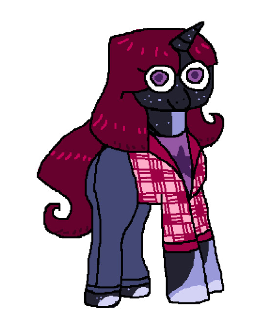

my terrible drawn-with-my-mouse MS paint doodle of my Moondancer Elise (elise from dan vs pony oc obviously!!!!!) pony vs my slightly-more-refined ibis paint drawin on my phone ahsdnsdand
her outfits and hairstyle will probably change a lot (just like the others) so this is just a basic idea
accidentally, she looks a bit like my oc artemis (designed by Baphometal on TH; art by pajjarrito on TH):

just from the dark blue with the speckles and lighter markings and stuff, but they aren't actually related lol
i generally really like the vibe of dark bluish hues with lighter blue/white markings on them so...
anyway the idea i have for her so far is that she works for the deities in a somewhat secret way but not rlly to the same extent as elise from the show; the 'government' on tyran/the deities don't have much that needs to be kept secret aside from maybe important documents, some weaponry/technologies, etc. to prevent them from getting into the wrong hands? she probably works oddball jobs for the deities depending on what they need and maybe the 'secretive' element of her work involves interplanetary/perhaps even interdimensional travel and stuff.
possibly she has to keep the interplanetary element of her work secret but the people around her generally know that she does some important work for the deities. i think that a lot of her work would involve bodyguarding, whether protecting the life of specific beings or whether protecting items or objects when it comes to interplanetary affairs. this aspect of her life needs more development for sure hsadnasnd i will probably come up with more 'government' related conflict to happen on tyran, maybe related to tyrani's past reign and trying to ensure that similar doesn't happen (it's possible that in the attempt to prevent a dictator from ever usurping them, they go to some morally ambiguous lengths..) but for now yeahhh i was originally just going to have her be named Moondancer and that's it, off of the G1 pony, but i was already worried that might cause conflict bc it might get confusing with it being a different character from the original, so i think her name will be Moondancer Elise (this also allows for her mom to be named _ Elise also so the elise jr./sr. thing is still vaguely accurate)
part of the reason i wanted elise to be vaguely inspired by moondancer from g1 (aside from the whole 'dancing shadow' thing) is because this mini storycard thingy that came with moondancer is lowkey giving elise..... tell me im wrong (image yoinked from mylittlewiki.org)

maybeee this shows my bias of thinking that elise is a LITTLE BIT OF A SASS (to put it lightly) but like im not crazy its giving elise right ?!?!?!?!?!
anyway moondancer
edit: added hyperlinks to baphometal and pajjarrito's THs i felt guilty for including it for my little wiki and not them so ahdsadnasd
#mlp#ponies#my little pony#dan vs#pony#oc#original character#mlp fim#tyran#tyran mlp au#tyran mlp#tyran lore#lore dump#oc lore#lore#original universe#art#drawing#character design#character art#original art#character concept#idk if all the tags are annoying#sorry if they are asdnadnsadn#fanart
9 notes
·
View notes